
Is this how the “funnyback” earned its nickname?
There’s always something new to discover when you start collecting. After all, the search is half the fun – especially if there’s a story to go with your latest find!
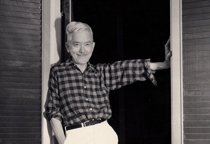
 Currency Grader Heather takes
a break from examining large-size
bank notes.
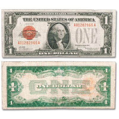
Curiosity came knocking in a recent Showcase catalog. Littleton Coin Company highlighted a small-size 1928 $1 Legal Tender Note. It’s a collector must-have for a number of reasons, including its limited print run of just two months and 27 days.
And, when it comes to collecting currency design, it shares an unusual nickname with the 1928 $1 Silver Certificates – funnyback.
“Even now, more than 90 years later, it’s a note that still stands out,” said LCC currency grader Heather, who appreciates the intricate design work on paper money. “It’s as much about art as it is about trying to prevent counterfeiting.”
But what prompted that odd name?
Lose the Inches
As the 19th century turned into the 20th, the variety and quantity of bank notes – then sized at 7 3/8″ x 3 1/8″ – were multiplying. So were the paper and ink costs to print the large notes. In 1925, Secretary of the Treasury Andrew W. Mellon convened a committee to rein in expenses.
The make-over (right) resulted in two changes:
- a 25% reduction in size (6.14″ x 2.61″)
- a new typeface
Skilled in script and square lettering, Bureau of Engraving and Printing (BEP) designers used a Gothic font for the letters and numbers. They kept the scrollwork framing the presidential portraits and the note’s borders that were part of a redesign in 1923 that had an Art Deco flair.
The BEP’s next step was a nationwide campaign to alert consumers that the notes they had been using since the Civil War were going to change.
Selling a new “look” – but whose?
In 1927, the BEP sent displays to banks. It also sent speakers around the country. In 1928, the wraps were taken off the snazzy and smaller silver certificates and legal tender notes.
To use a popular phrase from the Roaring ’20s: Everything was copacetic.
Except in New York. There, a different buzz was building from the one in Washington, D.C. A graphic designer of growing renown, W.A. Dwiggins (left) was enjoying widespread, and favorable, reaction to his book, Layout in Advertising, published by Harper & Brothers. Like the new BEP notes, his book was also released in 1928.
Dedicated to Madison Avenue executive Paul Hollister, with whom he shared a similar viewpoint, Dwiggins took a general swipe at the BEP’s font choice. “Gothic—the newspaper standby—in its various manifestations has little to commend it…It is not overly legible. It has no grace,” he wrote.
In four short years, Dwiggins’ opinion against Gothic grew to be more pointed, his aim at the BEP more direct. And, he wasn’t alone.
Throwing Shade
In July 1929, the new, reduced-size notes started rolling off the BEP presses. A few months later, the first criticism was made public.
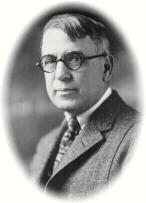
Former BEP director Louis A. Hill (right) “denounced in a letter made public today, [the new currency] as ‘the poorest, confessedly the cheapest, and without doubt, the most dangerous issue of United States currency in history,” according to The Numismatist of November 1929.
Hill, who had retired in 1924, centered his criticism around security concerns. The American Numismatic Association’s monthly publication reposted his claim that the new size and design could be easily copied “because the workmanship is of necessity more crude.”
A couple of months later, Dwiggins’ cohort and ad man Paul Hollister published the next critical remarks in The American Printer of January 1930:
“There is a faint resemblance between the face in which are printed certain remarks about the certificate, and a so-called Gothic type face – but it is not an honest Franklin Gothic, nor one of the pure revivals of that plug-ugly face; it is rather a badly flattened square Gothic.”
But, as Heather pointed out, “There are designers who like Gothic because it’s a style that presents information in a practical manner.”
No clap back?
Currency collector and assistant editor of The Numismatist, George H. Blake wrote an even-handed observation about the uproar for the March 1930 issue. The new look, he wrote, “…has had some severe criticism, as well as commendation. Only the future can tell whether this radical change in our paper money will be a success.” The controversy could have faded to black at that point.
But it didn’t.
Dwiggins – whose growing clout as a magazine and book designer appeared unstoppable – was furiously working on an analysis of the design shortcomings of American paper money. In 1932, the Limited Editions Club published his slim treatise, Towards A Reform of the Paper Currency. “I shall endeavor to demonstrate that these tokens… are symbols of degeneracy rather than of distinction,” wrote Dwiggins in his high-minded introduction, later stating emphatically, “The word one on the back of the one dollar certificate is unquestionably a worse specimen than…[the] word five.”
Dwiggins’ campaign went so far as to prompt Time magazine to weigh in with an analysis titled “U.S. Cash Flayed.”
Then came the June 1932 issue of The Numismatist and this eye-stopping headline surely read by currency as well as coin collectors: “Our paper money is all wrong, says Dwiggins.” “The art in the design of our money is speckled with mildew” and Dwiggins “wonders how the money designers managed with infalliable accuracy to get all the elements out of place and all the relations wrong and all the shapes bad.” “It’s always interesting – and sometimes entertaining – to read differing points of view,” Heather continued, adding, “but in the end, you have to make up your own mind.”
Who gets the last laugh?
Who actually coined the nickname “funnyback” about the mismatched face and back designs may never be pinpointed. But one thing is clear, by the summer of 1935, a new design was rolling off the BEP presses. On the back, it featured an unfinished pyramid, an all-seeing Provident eye, a heraldic eagle – and a new streamlined, urban look for that Gothic font.
The new design didn’t prompt any funny comments.

