Fleshing out the history of nudity on US money

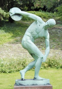
Bronze copy of Myron’s “Discobolus” at the University of Copenhagen Botanical Garden, Copenhagen, Denmark
Nude: devoid of a natural or conventional covering, especially a person’s flesh.
Whether you say nude, naked, unclothed, in the buff or nekkid… It’s the most natural state a person can be in. And yet, the only thing that’s socially acceptable is to cover up.
It seems as though this unwritten policy holds true for nudity on US money, too! Artistically speaking, nude figures make for beautiful paintings and sculptures. So it would stand to reason that currency – one of the most common forms of artwork in history – might also feature some tastefully artistic nakedness from time to time.
And so it has. But it’s a good thing that money (well, coins at least) has a long shelf life. Because whenever a breast is bared, or abs of steel debut, certain groups raise their arms and cry indecency.
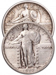
 Perhaps the best-known “cover up” in American coinage history was that of the Standing Liberty quarters. First issued in 1916 as our country was on the brink of entering World War I, these coins featured a bold depiction of Liberty standing in a gateway. In her left hand she holds a shield, while the right carries an olive branch of peace. But one little detail went unchecked…
Pundits clutched at their throats and uttered a collective gasp when it was revealed that Liberty’s right breast was bared. Perish the thought! Publicly showing that much skin… it was tantamount to heresy.
Needless to say, quick adjustments were made to the design, and partway through 1917 the Type 2 Standing Liberty quarter debuted – and this time, Liberty’s chest was modestly covered in chain mail. It’s still a lovely yet powerful image, even if it is modified from designer Hermon A. MacNeil’s original.
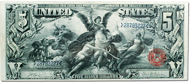
But even before MacNeil’s Liberty sashayed on to the scene, nudity had proven problematic on some of America’s beautifully detailed large-size paper money. One of the most beautiful vignettes I’ve ever seen is the one on the Series 1896 $5 Silver Certificate. It’s part of the “Educational” series, which yielded three of the most detailed currency designs ever. Officially called Electricity Presenting Light to the World, the vignette depicts a winged goddess as the embodiment of electricity, proudly holding a light bulb.
Not only is her breast exposed, but the drapery around her lower half dips down dangerously low too. Yikes. As you can imagine, that sent a good number of factions into quite the tizzy – including the New York Society for the Suppression of Vice. Some say the founder of that organization, Anthony Comstock, pressured the Treasury Department into discontinuing this design.
Combine the outcry over the $5 note with the fact that there were many complaints about the quality of the printing on the bills themselves, and the entire Educational series was doomed from the get-go. It was just a few short years later that all three denominations ($1, $2 and $5) printed with these ornate designs were retired forever.
What it boils down to is, the engravers employed at the U.S. Mint are artists. They take great pride in their work, and have an appreciation for beauty and natural form. But it almost seems as though they were better-enabled to express their God-given talents in the 19th and early 20th centuries… Perhaps time has conditioned these folks to shy away from anything other than the tried-and-true?
Currently there’s been a push to loosen our grip and let these folks show us once again how beautiful America’s currency can be. I’m excited to see what the next generation of coinage designs will have to offer!


I do hope our coin designers can do better, the presidential dollars are uniformly horrible. The statehood/ territorial/ national park quarters have some very nice designs ( and a few clunkers).
The Native American dollars are some of the most beautiful we’ve seen in a long time – particularly the 2013 one